I’m writing this on my new personal computer. It’s a lot more personal then my old one, which I still have. Some would say that it’s more personable too. I’ve bought myself an Apple PowerBook G4 12-inch and it’s just astonishing.
I wasn’t particularly in the market for a notebook computer, but I’d lusted after the PowerBook for quite a while and my recent bad luck with the Windows box convinced me that it would be useful to have another computer as a backup. Also, I thought it would be a good way to get some UNIX experience and generally be less Windows-centric. However, the event that led to the removal of credit card from wallet was Apple recently simultaneously lowering the price of the PowerBook range and upping the specifications—seen by some as a sign that G5 PowerBooks are on the horizon at last.
I went for the SuperDrive model, which is Apple-speak for a built-in CD-RW/DVD-R drive. I also paid an extra £50 to take the RAM up to 768 MB and bought a Brenthaven backpack that’s tailor-made for the 12” PowerBook. Shortly afterwards I added Microsoft’s Philippe Starck optical mouse as a suitably stylish two-buttoned accessory.
 |
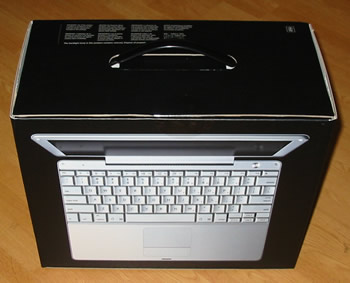
Those who read my iPod review will remember how enthusiastic I was about the design of the box it came in, and my new purchase didn’t disappoint in this regard, either. The PowerBook comes in a black box with a plastic carrying handle on top. There are white Apple logos on the ends and actual size pictures of the machine with the screen both open and closed respectively on the sides of the box. Although the handle implies practicality, I don’t think I’d want to carry this box around in public, at least not without some heavies at my side.
 |
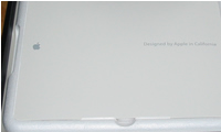
The box unfolds open to reveal a polystyrene molding covering by a shiny piece of white cardboard with the Apple logo on the left and “Designed by Apple in California” on the right. Removing this cardboard uncovers a compartment containing the manuals and paperwork as well as the bundled accessories. You get Mac OS X and OS 9 install discs—the OS X one is actually a DVD, not sure about the other one—a mini DVI to VGA connector, a mini DVI to full-size DVI connector, a modem cable and the components of the power brick. The power brick is a scaled-up version of the iPod one, with a missing corner into which you can slot either the Apple-supplied plug or the Apple-supplied extension cable. It also has two flaps that fold out for winding the computer end of the power lead around.
 |
Underneath this top compartment is another polystyrene molding that holds the computer itself. After removing the protective wrapping I picked up the PowerBook and was surprised by how heavy it was. The build quality is excellent and I shudder to think how heavy the 17” model is. There are no external protrusions sprouting from the casing like you get on lesser notebooks. Even the underside is beautifully designed, with a fairly large silver screw that you turn through ninety degrees to release the battery and access the memory compartment. The battery has five tiny holes in a line that glow lime green when you press a small button, to indicate the current charge level without having to turn the computer on.
Depressing the button on the front releases the screen, which opens in a clamshell arrangement, rather like the bonnets on some cars, for example, the original Renault Clio. This button also contains a LED that gently pulses white when the computer is asleep. The screen catch is completely flush when the screen is in the display position and it only protrudes just before the lid is fully shut. I’m not sure how the mechanism works but it’s neat. Also neat—albeit completely shameless—is the Apple logo on the back of the screen that illuminates white when the screen is on.
The external ports are all arranged down the left hand size in descending size order—modem, Ethernet, FireWire, USB 2.0 (x2), mini DVI, audio in, headphone mini-jack and finally a slot for a cable lock. On the opposite side is the SuperDrive, which uses a slot instead of a drawer. That’s all there is; no serial or parallel ports and no PC Card slots. This is 2005 and Apple won’t compromise the design of their machines for legacy technologies. The combination of FireWire, USB and Ethernet should be sufficient for most needs. The metal casing replete with allen screws and the silver colouring elsewhere all combine to produce a gorgeous look that says technical.
I plugged in the power lead—which emits an amber ring when charging that changes to green when charged— and switched on. After a few moments the bleepy sound of Royksopp’s “Elpe” came over the built-in speakers and I was in the final stages of Mac OS X Setup. I answered a few simple questions and then I was logged in and could being exploring the alien and wonderful world of Mac OS X. Oh and the X is pronounced ten if you didn’t know.
It’s really a rather disorientating experience to switch to a different operating system after about twelve years of using Windows. I imagine that it’s like being with someone new following a long marriage; there are lots of new experiences to be had, but things you take for granted are no longer true and other things are just plain different or not there at all! Fortunately I had a guide to ease the transition, but it’s still disconcerting. I’ll give you a few examples of what I mean.
In Windows, closing the main window of an application almost always closes the application, but not so in OS X. The application continues to be in memory as indicated by an arrow at the bottom of its Dock icon. You have to quit the application explicitly to shut it down. Something else that takes a while to get used to is the different keyboard layout. Obviously the Windows keys are gone, but there are now Command keys and a mysterious Option key. I actually quite like it now, particularly because the clipboard uses the Command key, which means that text can be copied and pasted from a Terminal window without sending Ctrl+C or Ctrl+V, as happens in a Windows’ Command Prompt. Alt-Tab is present, only it’s Command-Tab and although it beautifully showcases OS X’s alpha-blending effects and photo-realistic icons, bizarrely it doesn’t activate the main window associated with the application that it gives the focus to.
I’ve now been using OS X Panther for three weeks and can honestly say that it blows Windows XP away. Aside from the fact that it gives you access to FreeBSD UNIX, everything that I’ve encountered so far just seems to have been thought through more than on Windows. I guess that’s the luxury that not having to be compatible with twenty year old software gives you. My PowerBook has a 1.5 GHz PowerPC processor, which although it doesn’t sound very fast nowadays, is a RISC chip, so the speeds aren’t directly comparable to Intel’s CISC processors. Anyway, in spite of its theoretically lesser specs, graphics are noticeably smoother, without the stuttering caused by the compatibility cholesterol clogging the arteries of Windows.
Windows NT was designed to be a multi-user operating system, but that decision never really seemed to make its way through to the Windows shell, which often feels like it was designed with single user computing in mind. Apple may have copied Fast User Switching from Microsoft, but they do it so much better and that’s not taking account of the flashy cube animation that heralds a switching of users. Throughout the OS, if you haven’t the permissions to do something then OS X will obligingly offer a dialogue where you can enter the credentials of an administrator before carrying on as normal.
Browse the Applications folder using the Finder and you could be forgiven for thinking that the stunning icons in there are executables. They are in a sense because you can double-click them to open the application that they represent. OS X is much cleverer though, for these are actually packages and you can see inside them if you’re so inclined. What this means is that everything the application needs to run is hidden away in the package represented by each single icon, which in turn means that applications can be moved around as easily as any other file. It’s brilliant and it works.
I haven’t even mentioned AppleScript—the English-like scripting language that can probably automate any task—nor the built-in speech and speech recognition support, or the amazingly high-quality iLife suite and GarageBand 2, or the fact that Java and Python are both built-in. Mac OS X isn’t perfect though: dragging the icons of removable media over the Trash icon to eject them is still insanely stupid, even if the Trash icon itself does now change to an Eject icon to give you a clue as to what will happen. As for everything else, well it seems to not only look beautiful, but work beautifully too and without any fuss or problems. There can be no higher recommendation than that. Why wait for Windows Longhorn when you can own a Macintosh today?
Comments
There are 8 comments on this post. Comments are closed.
How are you finding the size of the 12-inch Powerbook, particularly the screen with its relatively low resolution? I'm sorely tempted to shell out for a Powerbook at the moment (well, maybe after Tiger is released) but now that I'm used to the 1600x1050 resolution on my work laptop it seems like a step backwards to drop down to even the 15-inch Powerbook...
Matt, I find the size just right. My desktop is running at 1280 x 1024, so the step down to 1024 x 768 on the PowerBook isn't too bad. Out of interest, what size is the screen on your work laptop?
15-inch screen, and with Cleartype turned on (another thing which I worry about losing if I move to a Mac) it makes for a very pleasant reading experience, even though I'm getting too old for the tiny fonts I would have used in the past to cram maximum content onscreen.
Matt, Frist of all, OS X can do font antialiasing too. You can even specify that it not be used for fonts of a certain size or below, which I don't think you can do with ClearType. Secondly, surely 1600 x 1050 isn't the native resolution of your 15" screen? I find TFT screens to be completely unusable if they're not set to their native resolution.
Cleartype isn't about antialiasing - see http://www.microsoft.com/typography/WhatIsClearType.mspx , and my experience is that it makes a significant difference to on-screen readability. wrt resolution, it's actually natively 1680x1050 (WSXGA I think).
Hmm, better tell MSDN then! http://msdn.microsoft.com/library/default.asp?url=/library/en-us/gdi/fontext_0xgn.asp No disagreements from me about the effects of it though.
Just ordered my new 12" G4 "Powertoy",and since I couldn't find any pics on Apple website to satisfy my curiosity enough(I want it yesterday!!)& I live in the boonies so in-person-eyes-on is impossible,google-image sent me here. I can almost hear the "oohs"&""ahs", and your descriptions are great. I,too,am a long-time Windows user,tho completely self-taught and a total "outsider" when it comes to the techie world,(or any world,for that matter)so I can't wait to play with my new "Tiger". Bites & scratches will probably ensue,but that is all part of the fun for me! Hope to have time soon to check out more of your site.
Sorry,John,I should have been more specific about my location,but as Google just "sent" me to your "Powertoy" page and I was too impatient to have checked out your geographical location before I started "gabbing",I am located in the US,in the state of West Virginia. It is a mostly rural state surrounded by Ohio,Pennsylvania,Maryland,Virginia and Kentucky. We West Virginians are always very specific about this since so many Americans these days are utterly geographically ignorant(among other things!!!)& think we are just the western part of Virginia. We became a state during our Civil War because we were against slavery. We are one of the poorer states as well,so I guess next time there is any sort of disaster here we had better watch out or Bush may arrange to have us herded into large pens and forget about us. Oh,wait,I forgot. We don't have anything he wants here. (Sorry for the tiny rant. You don't want to get me started!)