This is a post that I've been waiting to write for a long time. I have spent what at times has seemed like forever developing a new blog application in my spare time to run my website on. You're looking at the result. I was motivated to do this for several reasons. First and foremost, I've never been entirely happy with the appearance of the second version of my blog. I was happy with the first version which ran from 2003 until 2005 which I designed myself, but I hacked together the look of its successor rather quickly. So I wanted to actually pay a professional designer to kick the aesthetics up a notch.
Secondly, I've grown disatisified with WordPress as a blogging platform. Now WordPress is a fine application and to be fair, the latest versions are considerably more polished than the version I started out with back in 2006, but it wasn’t a good fit for the way I write posts. Things probably came to a head when I spent a long time fighting against WordPress with the code listings in Installing Mint On A Rails Machine. I needed something that better fitted my blogging requirements, something that would fit me like a glove if you will. That meant a bespoke solution was called for.
Thirdly, I love writing Ruby on Rails applications and writing a blog is the canonical Rails application. As Geoffrey Grosenbach wrote:
“…every beginning Rails developer should write their own blog software. It’s a great learning experience and you can try things that aren’t possible with just an app running on localhost. It’s also a great environment for learning without the pressure of a mission-critical app.”
The course was set. This post details the journey.
Visual Design
Once I'd taken the decision that I was going to create a new blog from scratch, I emailed Mike Rohde at the end of May 2007 and asked if he would be interested in coming up with a new graphic design for the site. I chose Mike because way back in 2005 I read Ian Landsman’s post about working with Mike to create a business logo and I'd been impressed with the end result. I'd also worked with Mike before on a as-yet unrealised design project, so I knew that we were a good fit.
Fortunately Mike agreed and was available. The brief I gave him was that the new design should use a strict grid layout that puts content first and is easy to read. I also wanted to get rid of clutter and I expressed a strong preference for using the Helvetica font. Helvetica is now a bit of a design cliché but I like it and think it looks great. I also told Mike that the colour orange had to feature somewhere!
We agreed to approach the design in two phases: design sketches and mockups with supporting graphics and XHTML/CSS templates with finalised graphics. The latter was unusual for me because I normally create my own XHTML and CSS, but it turned out to save a lot of time because I was going to have my hands full creating the underlying Rails application.
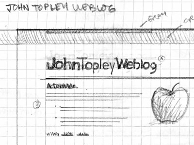
- After a couple of months of further discussion Mike came back to me with his initial exploratory sketches (click to enlarge):
—Even at this early stage the grid structure was apparent, as was the clean Helvetica header.
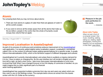
- Another round of email exchanges followed and we quickly moved to the first colour mockup creating using Fireworks (click to enlarge):
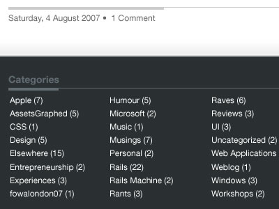
- For the second colour mockup, we switched to a darker header and footer (for added “oomph” in Mike’s words!), with the result that the design started to resemble the final version you're reading now (click to enlarge):
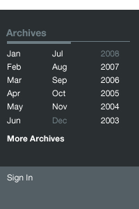
- Further tweaking followed, in particular the category and archive links in the footer were tidied up, so that only the month names for the most recent twelve months were shown, along with the most recent five years:
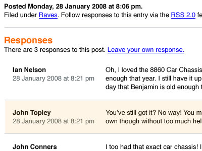
- Once the design for the home page was finalised it was converted into actual markup and CSS and we moved on to thinking about how an individual post with comments should look (click to enlarge):
—The design of the comments section was inspired by Subtraction, with the commenter name aligned on the left edge of the grid and the comment text on the right. Comments by myself are highlighted with an orange tint.
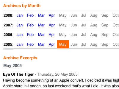
- The design of the individual post page didn’t require many iterations, so we progressed to the design of the Archives page (click to enlarge):
—The Archives page resurrects the idea of having excerpts from each post, which was a feature that I liked from my original blog. It also introduced breadcrumb links to make site navigation easier.
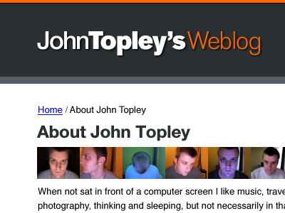
- The About page was the remaining distinct type of page and was designed at the same time as the Archives page (click to enlarge):
—For this page I'd come up with the unoriginal and somewhat ridiculous idea of including sets of small pictures of my face taken using Photo Booth on my Mac. It was supposed to be a pop art sort of idea. Mike graciously indulged me!
Looking back at my emails, Mike and I spent a period of a year iterating over the new design of this site. I found the process to be a lot of fun and I'm absolutely thrilled with the end result. Mike’s a great designer to work with and I'm not surprised that Apple offered him a job. Thanks Mike.
Technical Implementation
At the time of writing, this site is a Ruby on Rails 2.3.3 application hosted on a 512 MB Slicehost VPS slice running Ubuntu Linux. The site is served using Phusion Passenger (mod_rails) fronted by Apache. Passenger is using Ruby Enterprise Edition, which is a fork of Ruby that includes an improved garbage collector and memory allocator so that memory usage is reduced by a third when used in conjunction with Passenger. MySQL 5 is the database server and Sphinx powers the site search.
I started development work on the application in December 2007, although in May 2008 I undertook some significant rework to take advantage of the named scope feature introduced in Rails 2.1. Named scopes enable class methods to be added to a model for narrowing a database query. For example, the Post model includes the two named scopes (published and recent) shown below:
class Post < ActiveRecord::Base
  named_scope :published, :conditions => { :published => true }
  named_scope :recent, lambda { |count| { :limit => count }}
end
These can then be chained together in interesting ways. For example, in the PostsController they're used to retrieve the ten most recent published posts to get the data behind the posts Atom feed:
@posts = Post.recent(10).published
—As you can see, this makes for some extremely concise and readable code.
Another change that happened during the long development period is that I followed the Rails project itself by moving from using Subversion (SVN) for source code version control to using Git. I didn’t really want to do this at first because I like my version control systems to just get out of the way as much as possible i.e. I didn’t want to have to spend mental effort on making the switch. However, I'm glad that I did because Git is an order of magnitude faster than SVN and its branching support is far superior, enabling me to keep work on individual features under control. It also means I get to use the wonderful GitHub, which is where the Rails source code for this site is hosted in a private repository.
I write posts for this site using the Markdown text formatting syntax which is then converted into XHTML markup using the RDiscount Ruby gem. Alternatively, the post editor lets me enter or edit markup directly.
By far the biggest headache I faced when developing this new blog and also the reason that the process took so long, was that I had to migrate existing content—both posts and comments—from two separate blogging platforms i.e. my original site generated using CityDesk and then its WordPress successor. This turned out to be far more time-consuming than I'd imagined because I also had to review the content and fix up links etc. According to my diary, migrating the old blog posts took from January 2008 to January 2009! With hindsight I should have invested some some time upfront on developing some tools to automate what was largely a manual process. I did write some Ruby scripts to get the existing comments out of WordPress and out of the original blog’s PHP comments system written by my friend John Conners.
It won’t surprise software developers reading this to learn that the development of this blog application isn’t actually finished! Aside from the question of whether software can ever truly be considered finished, there are some administration features that I still need to complete and I haven’t really done any server-side performance work yet. I've done quite a lot of client-side performance tuning, but I'll save discussion of that for future posts.
So that’s a rundown on how I put my new site together. It took slightly longer than the fifteen minutes to create a weblog shown in that Ruby on Rails screencast, but I think the results are worth it. There were a few times when I didn’t think it would ever get done, but I largely enjoyed the process and I hope you enjoy the results and keep coming back.
Comments
There are 5 comments on this post. Comments are closed.
At last! Welcome back to the world of blogging and congratulations on getting the platform up!
Seeing the clean design for real makes me want to redesign mine, which means it's a great design - very swish!
It's a really clean and polished design John, nice work!
Design: most excellent!
Code: come on, let's see some...
Personal: glad to have you back online, and, no, coding is never done.
Cheers, Julian
Thanks guys! Those comments mean a lot to me coming from you.
@Julian: Don't worry, they'll be plenty of code in future posts...
John, thanks for choosing me and for creating this detailed write-up of the design process.
I had a great time working with you on this project and I think the end result turned out splendidly.
Cheers and congratulations!