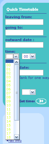
I booked some train tickets the other day using Qjump and was shocked by the colour choices in their user interface. They’re using some funky JavaScript in the text fields in the Quick Timetable section on the left of the page. It highlights the text you entered in light green on a white background! Check it out:

—I’d hate to see the clothes worn by whoever was responsible for that!
Comments
There are 4 comments on this post. Comments are closed.
What's even stranger is if you bring up the drop list then hover off it, they change from lime green to a much more sensible blue - then when you hover over again it's back to lime. Whoever did it must have thought they were being oh-so-clever!
It's really weird, isn't it? What were they smoking?!
Works fine in IE so we can only assume its the :hover selector that Firefox implements properly.
What’s even stranger is if you bring up the drop list then hover off it, they change from lime green to a much more sensible blue - then when you hover over again it’s back to lime. Whoever did it must have thought they were being oh-so-clever!