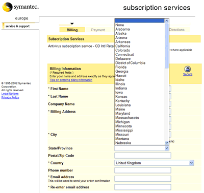
Many websites invite their users to visit a regional version of the main site, but unfortunately few seem to manage to get the localization right. I recently had to renew my Norton AntiVirus subscription and I was directed the European Symantec site, where I was confronted with a classic example of poor localization. This is the subscription renewal form that came up:
—Why an earth offer a list of states of the union when it's a European site and I've selected United Kingdom as the country?! That's just laziness.
 |
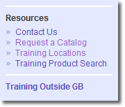
As another example, yesterday I was investigating Sun Microsystems' Java certification, which led me to the support and training site for UK and Ireland.
Down the left hand side of the page I was invited to Request a Catalog. I had a dilemma at this point because I didn't want to request an American catalog but rather a British catalogue. Fortunately, as it turned out I could do neither, because clicking the link took me to the site map, for the page could not be found. Well done Sun!

Comments
There aren’t any comments on this post. Comments are closed.