As today sees the launch of Windows 7, I thought it would be interesting to write some thoughts on Microsoft’s latest blockbuster from the perspective of a so-called switcher. Although I use Windows XP in my day job, I've used Macs exclusively at home for the past three years. Nevertheless, I've been a Windows user for four times as long as that, having first used it in the distant days when you started Windows by typing “win” at the C: prompt. So I think I'm qualified to offer an opinion at least, but don’t expect this to be a comprehensive review that will tell you how well Windows 7 will run on your three year old laptop, or what the upgrade experience from Windows XP will be like, or which product edition from the bewildering set of choices you should opt for. There are plenty of other resources online that can answer those questions. This is merely my personal perspective as an Apple convert who’s revisited an old friend to see what he’s been up to lately. And Windows is definitely masculine, by the way.
Windows And Me
Any long-term readers of this blog will have noticed a definite sea-change over the years. I used to be broadly pro-Microsoft, with an appreciation of the great lengths that they go to in order to ensure backwards compatibility. Windows 95 hadn’t been out long when we bought our first family PC and I thought it was a great consumer operating system and a giant leap forward from Windows 3.1. I was also reading some of Andrew Schulman’s books on undocumented Windows where he detailed his adventures in reverse-engineering Windows to find out how it really worked, which often wasn’t the Microsoft party line on how it worked. There’s no doubt about it: far from running on top of MS-DOS as most people thought, the way Windows 3.x/9.x ran MS-DOS in a hidden system virtual machine was perhaps the most commercially successful hack of all time and technically intriguing.
Shortly after Windows 95 came out I discovered Windows NT and switched to it before it was mainstream and in truth, before I had the computing firepower to run it properly. You have to remember that this was in the days when RAM was still cripplingly expensive. I bought Windows NT 4.0 the day it came out and installed it on a PC with 16 MB of memory, which I eventually upgraded to 80 MB and finally 128 MB!
I think that Windows 2000 was probably the zenith of my Windows computing experience, in spite of its infuriating window focus bugs. I was having a lot of fun at that time practising Windows programming using Borland Delphi and getting my feet wet in the vast Windows API. I never really felt that Windows 2000 got a fair crack of the whip, as it was only on sale for about a year and a half before Windows XP was released. It seemed to have a very short amount of time in the spotlight given that we'd been waiting for Windows NT 5.0 for so long. I can’t really comment objectively about Windows XP because it’s just so old and familiar. What I will say though is that it always felt to me like it had been rushed out the door.
The Grass Really Is Greener On The Other Side
Nowadays I'm not exactly anti-Microsoft, it’s just that I've discovered better fruity alternatives from Cupertino. My personal experiences have actually borne out the idea that Apple’s products are superior by design and in execution.
I've always been interested in learning about operating systems and in trying to experience as many of them as possible just for their own sake. Indeed one of my motivations for buying my first Mac was that I wanted to learn about Mac OS X and UNIX. Clearly this isn’t typical computer user behaviour. If most computer users are even aware of the operating system at all it’s either because it’s infuriated them by going wrong, or it’s just a means to an end that lets them run the software they want. For most users the OS has an intangible supporting role and there’s absolutely nothing wrong with that, but for me it’s always been something worthy of exploration in its own right.
Virtually Windows 7
Let me start my Windows 7 review with the disclosure that I've only used the Release Candidate version running in a VMware virtual machine on my iMac. So I haven’t seen any of the Aero eye candy and I can’t comment on the performance of running it on native hardware. I simply don’t use Windows at home often enough to justify giving it a home of its own using Boot Camp. What I can say unequivocally is that Windows 7 running in a VM is faster that Windows Vista running in a VM. In fact I deleted my Windows Vista virtual machine with indecent haste because I was worried about prematurely ageing my iMac’s hard disk which was being thrashed continuously. The kindest thing I can say about Windows Vista is that I always thought it was a good name, although sadly it’s now gone the way of the Edsel i.e. the name is tarnished forever. Microsoft promised us so much with the Windows “Longhorn” vision at PDC 2003 and delivered so little, just as they did ten year’s previously with the “Cairo” project. Like The Who, I won’t get fooled again.
Exploring Windows Explorer
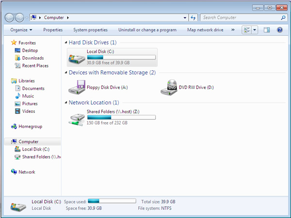
Windows Explorer has always been somewhat controversial, many users never quite getting over the replacement of the Multiple Document Interface (MDI) of the old Windows File Manager with the single window world-view of Explorer. I never thought that it was that bad—after all you could always run multiple instances and drag things between them—but the Windows 7 version looks like a complete dog’s breakfast to my eyes and makes no sense at all (click to enlarge):
The window itself looks starkly barren without any text in the title bar, but maybe that’s something all those Windows Vista users are familiar with by now. Even more strange is the fact that you can still click the top left corner of the window to bring up a menu (or double-click to close), even though there’s no longer an icon, and thus any affordance, there. Windows' backwards compatibility is alive and well, thank you very much.
There’s a menu bar that bizarrely only appears when you press Alt and when it does so it’s not in its rightful place at the top of the window, but instead it’s further down. The main right-hand pane of the Explorer window has always technically been a listview control, only now it looks like a list even when it’s set to favour those pretty icons i.e. you get the clickable list column headers even when in icon view. Worse yet, sometimes horizontal text spans the visible column borders. The overall effect is a complicated clash of different styles and seemingly ill-considered.
When Explorer is open in the Computer view so that local drives are displayed, a status area at the bottom of the window shows pertinent information about the selected drive. Unfortunately the labels are arranged in a haphazard fashion without regard to design niceties such as lining the edges up. It makes me wonder if those responsible actually have access to a visual GUI builder tool, or if the user interface was created by manually editing GUI control co-ordinate values in a resource file.
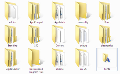
One of the selling points of Windows 7 is that it’s essentially the finished version of Windows Vista, in so much as Microsoft have now had time to smooth off all the rough edges and generally add a sheen of polish to the overall fit and finish. And generally, this is the case and when using Windows 7 you notice all sorts of nice little refinements. One of the gratuitous opportunities for improvement in Windows Vista that I noticed straightaway was the fact that you had these beautifully rendered new folder icons sat alongside old-fashioned Windows XP-era icons, as if somehow Microsoft didn’t quite have the wherewithal to stretch to a full facelift. The folder icon for the Fonts folder was one example. This has sort of been remedied for Windows 7. I’ll leave you to see if you can work out why I don’t think it’s been completely fixed (click to enlarge):
A Lot Of Stuff
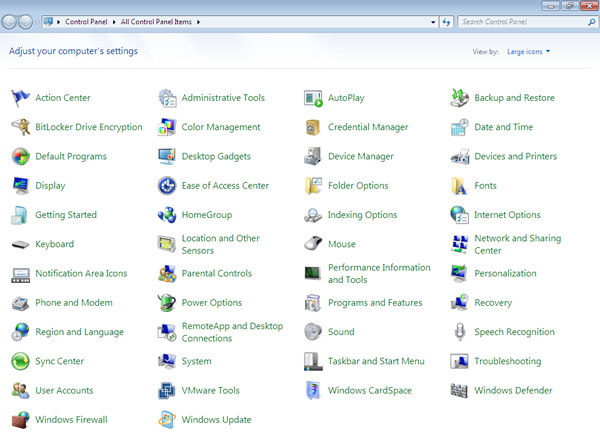
Moving on to the Control Panel now and my first impression is gosh, there’s an awful lot of stuff in Windows nowadays. This is the Windows 7 Control Panel, set to display all the icons (click to enlarge):
- Compare and constrast to the Windows 3.11 Control Panel:
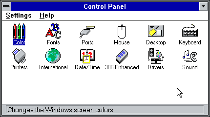
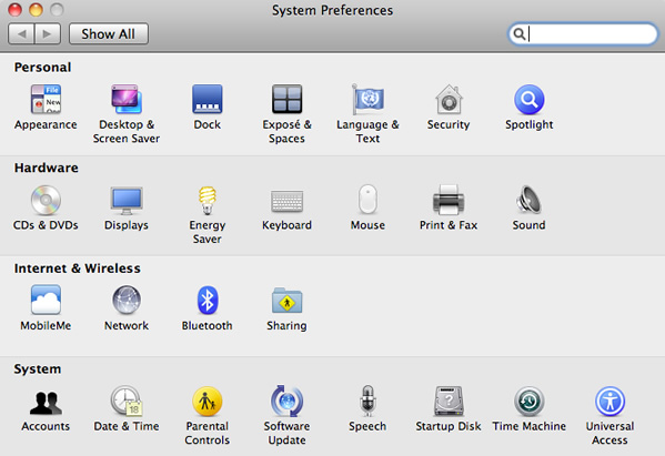
—Of course this isn’t exactly a fair comparison because comparing Windows 7 to Windows 3.11 is a bit like comparing today’s Ford Mondeo with the aforementioned Ford Edsel. The world has moved on and the modern incarnation does so much more. The point I'm making is that the latest Control Panel is rather intimidating. Mac OS X is at least as capable an OS as Windows 7, yet somehow manages to get by with this minimal selection (click to enlarge):
I guess this is the reason why Microsoft chose to hide its Control Panel complexities behind a façade of categories. Which brings me neatly to…
Workarounds And Band-Aids
Windows 7 continues the trend followed by every version of Windows released after Windows 95 of weighing down the shell with workrounds and band-aids that diverge more and more from the purity of the original ideas in the Windows 95 shell design, which itself was part of the “Cairo” OS vision. A good example of this is the shell Notification Area (usually erroneously referred to as the “System Tray”), which is the region that’s most likely in the bottom right-hand corner of the Taskbar by the clock. Applications that have no desktop presence can display a status icon in this area.
The problem with the original Windows 95 implementation of this feature was that it became a victim of its own success because pretty soon all the cool applications were putting an icon down there, until it became common to see Taskbars where at least half the width of the display was taken up with this row of icons. I'm sure we've all seen this, probably on a PC belonging to our parents.
 Windows XP introduced a customization feature whereby you could hide the icons that you weren’t interested in seeing. However, Microsoft have obviously decided that this exercise is too time-consuming (it was) because in Windows 7 it appears that most icons are now hidden by default and you have to click to open up a sort of overspill window to see them at all. The result of all this is that paradoxically the Windows 7 Notification Area hides most notifications by design. This is actually but one manifestation of a long-standing problem that Microsoft have had with Windows, whereby they provide a well-intentioned API for a feature, but it gets abused so they have to either work around the abuse or lock it down completely. And that’s why we can’t have nice things in Windows.
The thing that’s always struck me about Windows in recent years when I switch back to it after using a Mac, is just how often it interrupts what you’re doing. Windows XP in particular had the infuriating behaviour of displaying information balloons to nag you that you had unused icons on your Desktop, that updates were ready to install, that it was installing updates and that you needed to reboot after installing updates! Microsoft had the good sense to tone this down in Windows Vista, although instead they replaced it with the UAC dialogue that seemed to appear if you wanted to do almost anything with your PC. Thankfully Windows 7 has tamed this annoyance too, so that it’s almost as unobtrusive as Mac OS X is when it needs your password to temporarily elevate a privilege in order to perform some system-level task.
Using Windows still feels to me like visiting a patient that’s relying on all sorts of mechanisms to keep it healthy or even alive. Windows is the Darth Vader of operating systems. I'm always conscious that CPU time is being devoted to running threads that are making sure that I'm not pirating DRM protected media and that there are all sorts of background processes running to monitor for a nastyware outbreak. Whenever I fire up one of my Windows VMs it always takes a while before I can do anything useful, as it first has to download this week’s round of Windows Updates, then I have to reboot and then it probably has to download updated anti-virus and anti-spyware signature definitions as well. By the time it’s finished I've almost forgotten what I wanted to do in the first place.
Software updates are released by Apple for the Mac too, but they’re much less frequent and you don’t get hassled by the operating system about installing them. On the Mac you don’t generally feel like you’re waging a war against all the scum of the Internet, which is what the constant patching of Windows can feel like. And Mac OS X doesn’t have to tie up precious computing resources defending itself again viruses, spyware or pirates. Perhaps that will change one day, but I do hope not.
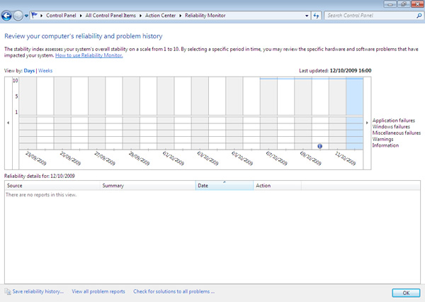
I'm sure years of jibes about the unreliability of Windows must have hurt if you work at Microsoft, but I can’t help thinking that it’s a bit geeky and quite frankly anal to include an application that lets you monitor and graph your PC’s reliability or lack thereof, but Windows 7 does include a Reliability Monitor (click to enlarge):
Over at Apple they just assume that the computers are reliable and that you don’t need to review their “problem history”.
The Fun Has Begun (Was “The Wow Starts Now”)
In a lot of ways Windows 7 reminds me of Windows 3.1 in that there’s quite a lot of fun features included with the OS itself before you add any third-party software. The venerable Paint program has had its first significant overhaul in years, gaining an Office 2007-style Ribbon menu—although I'm not entirely sure this is justified as Paint has a tiny number of commands compared to the Office heavyweights. By contrast, Mac OS X doesn’t even ship with a drawing program; a far cry from the classic MacPaint included with the original MacOS. Windows 7 comprehensively beats Mac OS X when it comes to bundled games too. The Mac tastefully includes a beautiful graphical wrapper around GNU Chess and that’s your lot. By contrast, Windows 7 ships with eleven games, including spruced-up versions of the old, ahem, secretarial mouse practice favourites FreeCell, Solitaire and Minesweeper and the totally Mac-derivative Chess Titans.
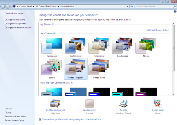
The opportunities for customizing the look and feel of your Mac OS X installation are pretty much limited to using the Aqua or Graphite theme for GUI widgets, plus changing the desktop background, screen saver and picking different sounds for system events. Windows has let you customize many aspects of its look and feel since the days of the infamous Windows 3.1 “Hot Dog Stand” colour scheme. Windows 7 ups the ante with a nice set of pre-canned “Aero Themes” that include appropriate desktop wallpaper, widget colours, screen saver and sounds (click to enlarge):
It’s possible to waste quite a lot of time playing with all these permutations until you get your Desktop set up just so, which is why I'm glad I use a Mac! Windows 7 copies from the Mac the ability to change the desktop wallpaper according to a customizable interval. Of course if that’s your thing then better alternatives are freely available.
Parting Thoughts
The consensus seems to be that Windows 7 is Windows Vista evolved; it’s the Vista that it’s okay to like or even love. Some people have called Windows 7 a service pack for Windows Vista which I think is a little unkind. Microsoft have clearly done a lot of work in making Windows tolerable to use again. If that sounds like damning with faint praise then it’s not meant to be. If we have to use Windows then it shouldn’t be unpleasant and there’s much to like in Windows 7. However, there’s nothing revolutionary here, nothing that advances the art of operating system design in a significant way. Don’t be misled into thinking that its support for multitouch devices is somehow a breakthrough, because multitouch is an evolutionary cul-de-sac on a vertically-oriented screen. It’s uncomfortable and inefficient.
If I must use Windows, then provided I was given a suitably modern PC, I think I'd be happy to use Windows 7 at work and would certainly find it less jarring than living with Windows XP. When it comes to spending my own money though I'm happy to stick with Mac OS X for now. It’s by no means perfect, but for me it’s better than Windows.
Comments
There are 3 comments on this post. Comments are closed.
A fair write up there John. I've been using the RTM for a couple of months now and I definitely prefer it to anything else Microsoft has shipped. The side-by-side thing you can do when you drag a window to each side of the screen combined with the Mac-like taskbar that remembers where you put programs make it worth upgrading alone.
On a cutting edge high-spec 64bit laptop like the one I'm running it on it works well and is pretty fast. I guess the problems may start on older or lower spec machines. YMMV!
Are those two features really worth the £83.75 upgrade cost, John? That's the cheapest upgrade price I could see listed on Amazon UK. The Ultimate edition upgrade price is £190.83, which seems extortionate to me!
The 64-bit question is, if by some misfortune your house was on fire and you could only save one laptop, would it be the Windows 7 one or your MacBook?
Nah, I'd rather spend my money on coffee! Fortunately I get it for free from MSDN so it's a non-issue.
And the Mac definitely - that's the one that has my life on it!