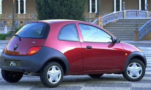
The Ford Ka is about to be replaced after an incredible twelve years in production. Incredible because to my eyes it still looks as fresh as the day it launched. Its New Edge styling was hard for a lot of people to stomach in 1996, but I think it’s aged rather well and the public must have agreed, for Ford have shifted lots and lots of them and have evidentally had a bit of a hard time replacing it.
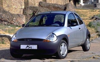
I love the Ford Ka. It’s the quintessential brilliant modern small car. Its mechanicals are ordinary and like a lot of old Fords its engine is the weak spot—would you believe it can trace its heritage all the way back to the that used in the 1960s’ Ford Anglia! However, the Ka makes up for it with a great chassis and individual styling.
Consider for example the interior door panels. Like many inexpensive cars the Ka has painted metal on the interior side of its doors, but unlike some competitors it proudly draws attention to the fact by using the circle of the window winder space to cut into the metal and make an interesting shape.
Talking of styling, another reason to love the Ka is that its design looked to the future with all those bold, discordant feature lines that somehow managed to hang together as a cohesive whole. The original Beetle, Mini and Fiat 500 all looked to the future too, unlike their bloated, modern-day re-inventions.
The original Leyland Mini had weld seams on the outside to maximize the interior space, whereas today’s BMW Mini is bigger than an old Ford Escort, or put another way, punching about two classes above where it should be, both size and weight-wise. To be fair, at least some of that is down to modern safety legislation, but manufacturers could be cleverer too. Mercedes-Benz leads the way, as both the A-Class and Smart Car feature a twin floor arrangement that’s designed to swallow the engine in a frontal crash, allowing a bigger interior space for a given length.
Back to the Ka. Even the name is interesting and somewhat contentious: is it the Kar or the Kay-A? I’ve always gone for the former, but with a truncated pronounciation to rhyme with “Ha!”, which amusingly enough was probably a common reaction when first setting eyes upon one. The earlier variants with the grey plastic bumpers and starfish wheels are my favourites.
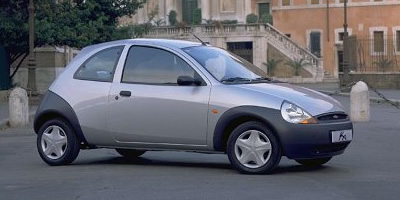
For me something of the design charm was lost with the later versions that have body-coloured bumpers and slightly flared wheel arches. The curve of the Ka’s bumpers is an important part of the design, so you do need that colour contrast. Those curves are also encoded in the typography of the Ka’s badge. You probably didn’t realise, but the cross-bar of the K is a deliberate echo of the Ka’s roofline and the leading curve of the A intentionally mirrors the curve of the back bumper as it sits above the rear wheel arch. Ingenious, eh?

The replacement Ka looks pretty funky at first glance, but lacks this sort of design integrity when you dig deeper. Essentially it’s a new Fiat 500 skinned to look like a smaller version of Ford’s brilliant new Fiesta. As an aside, I really wish that Ford had followed through from the concept car and used the Verve name for their new Fiesta, in recognition of it being a clean break from its boring predecessor. I guess the draw of the trusty Fiesta name was just too strong, but they did have the cojones to bin the Escort name when they pulled a similar move with the Focus in 1998.
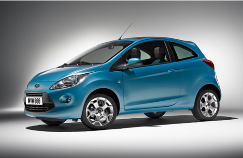
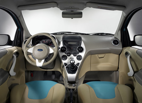
You can see the 500 in the overall stance of the Nu-Ka (keyword: stubby) and in spite of Ford’s best efforts, the centre console is pure Fiat, with the gearlever sprouting from the dashboard rather than the floor. They’ve even managed to spoil the design of that lovely badge, making it look like a creepy-crawly version of the old one.
It’s a shame that with the Nu-Fiesta/Nu-Ka combination Ford have decided to return to the corporate design aesthetic practised in the eighties and early nineties that led to a manufacturers’ entire range looking like upsized or downsized versions of the same car. There was a big outcry in the motoring press about it back then and we got some interesting looking vehicles again, such as the Fiat Bravo/Brava and the Ford Ka and Puma. The zenith of this counter-reaction was undoubtedly the original Ford Focus, which was a complete volte face from the nadir of the crushingly dull, last-of-the-line Escort. Ford should recall that people buy a car, not a range of cars and inject some individuality back into each model within their range. Let’s hope that we’ve not seen the back of cars like the wonderfully original Ford Ka.
Comments
There is 1 comment on this post. Comments are closed.
The old version is the same we had in Brazil, but our updated (this year) version is much simpler:
http://www.blogcarros.com.br/fotos/2007/12/ford-ka1.jpg
I find old one very, very ugly :)
Cheers,
hsuh