This is the third in a series of two articles in which I deconstruct the Windows XP user interface and show some areas in which it’s lacking or is just plain unfinished. You might be surprised to learn that I don’t actively go looking for these little inconsistencies, but when you spend quite a lot of your life using a piece of software it’s inevitable that you notice them.
They’re all trivial issues, but they’re still important because it’s the little details like these that contribute to the perceived quality of the product. This is why prestige car manufacturers such as BMW and Mercedes-Benz spend effort on making sure that the switches within their cars feel consistent and of equal quality when you use them. It’s also why the Apple iPod doesn’t just come in a cheap cardboard box.
Believe it or not, even Microsoft don’t have unlimited resources, so it’s important to understand that when creating any software, the creators have to prioritise what’s important to the customer and what’s not. The exhibits here are all towards the bottom of that list. Hopefully some (if not all) of these can be fixed for Windows Longhorn, because I’m really looking for a much more consistent Windows shell experience from that.
Exhibit L: Inconsistent Tooltip Shadows
- With the arrival of Windows 2000, Microsoft started to give more depth and polish to the Windows user interface by adding shadows to various elements. Windows XP continues this trend by adding shadows to the tooltips that appear when you hover the mouse pointer over the Start button (for example). It’s not consistent throughout the user interface though, because the tooltips for the window widgets don’t have a shadow:
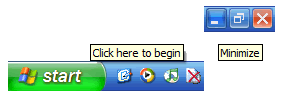 |
Exhibit M: Send To Menu
- Windows 95 introduced the Send To menu, which is very useful and may even be a Microsoft innovation. You can right-click on a file system object and send it somewhere else. Sadly, the menu highlight colour goes a bit awry in Windows XP:
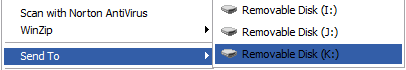 |
—To be fair, Windows shell God Raymond Chen has acknowledged that this is a bug and has passed the details on to the relevant team. I’ll be expecting this one to be fixed in the next version of Windows.
Exhibit N: Sub-Menu Arrows
- Menus in general seem to be a problem area within Windows XP. I’ve created a toolbar on my taskbar for My Computer, which means that I get a handy menu that allows me to navigate the file system without having to fire up Windows Explorer proper. There are two problems.
Firstly, I have the toolbar positioned at the right-hand end of the taskbar, which means that the arrows that indicate that there’s a sub-menu point to the right, when the sub-menu itself opens to the left. Lots of people have commented on this behaviour, but it doesn’t concern me because I can imagine how horrendous the code would be to correctly align the arrows. The second problem is that the arrows remain black when you hover over them:
—This is in contrast to the Start menu, where they change to white when highlighted:
Exhibit O: Icon Transparency During Dragging
 |
- This one is so picky that I almost don’t feel it’s worth mentioning, but I’m going to for the sake of completeness and because I’ve already gone to the trouble of creating the image for it! When dragging items off the Start menu to create shortcuts to them, Windows uses a nice alpha-blend effect so that you can still see what’s underneath the item you’re dragging. It doesn’t quite work though, because there’s a square hole around the icon for the menu item being dragged. I presume this happens because the hole is the transparent colour within the icon, therefore anything that’s underneath just shows through and bypasses the alpha-blending. It would look more polished without the hole.
Exhibit P: Shortcut Names For Dragged Start Menu Items
 |
- Once you’ve dragged your Start menu item mentioned in Exhibit O somewhere, it may have an ampersand in the default shortcut name provided by Windows. This happens if you drag one of the fixed Start menu items—such as the Search command— off the Start menu and drop it somewhere like the desktop, where Windows will helpfully create a shortcut to it. Only the shortcut gets named &Search. Windows programmers know that this happens because placing an ampersand before a letter creates a mneumonic access key. The letter gets underlined and the user knows that they can then access the item using the keyboard. Windows really ought to be smart enough to remove the ampersand when creating shortcuts though.
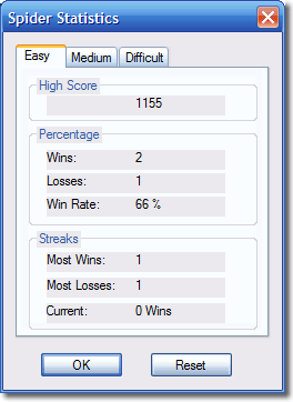
Exhibit Q: Form Label Transparency
- One of the attention to detail points that rooky programmers using a RAD tool such as Visual Basic or Borland Delphi to build GUIs sometimes miss, is that they need to set the background colour of labels on their forms to transparent. If they don’t and instead they rely on the user having the exact same colour settings as them, then they end up with amateurish looking forms like the one shown below from the Spider Solitaire game that ships with Windows XP. I don’t know if this game was developed using a RAD tool or not, but the point still stands. The Windows accessory programs aren’t developed by the core Windows team in Microsoft, but nonetheless I’m surprised that this visual bug made it through testing.
 |
Comments
There are 5 comments on this post. Comments are closed.
Exhibit O: No good deed goes unpunished. I added the drag/drop thingie as a cutesy. If I knew people were going to complain that it wasn't perfect I wouldn't have done it. Maybe I'll remove the feature for Longhorn just to stem the complaints.
Raymond, You make me wish that I hadn't written it now! It was intended to be more of an observation rather than a complaint. Please don't take offense. Anyone who has ever read your blog should appreciate the efforts that you and your team make. I know that I do.
Are you sure you're not nit-picking just a tiny bit John? ;) I've seen phenomenal attention to detail before but you're just taking it to a different level!
Erm, I'll take that as a compliment John!
Compliment intended!